Painting a backscene
Posted
Guest user
In the two scenes so far, I've been careful to avoid giving them a definite light direction. There would be nothing sillier than having say a bay window casting a shadow onto the wall to its right, indicating light from the left, then having a car or something on the layout with the shadow going the other way.
Personally I like to use an adjustable floodlight to vary the lighting in my photos - I know many modellers don't worry so much - and I like to try to depict different times of day and weather.
To this end it's important that my clouds, for example, don't look backlit, and that trees don't cast long shadows across the ground.
While I really admire photographic backscenes I see very real pitfalls in some due to the pre-set light and shade on buildings and in skies.
Please remember, these are only my opinions. I'm not saying I'm right and everyone else is wrong. It's just my way of doing things.
Mike
Posted
Inactive Member
Devon Junction
Kernow Junction
Kernow Junction

Posted
Full Member
You're dead right but that's a point I'd never actually considered. No doubt I'd have studied a scene for months knowing "something" was wrong but would never have realised it was simply the light direction.
That's yet another reason this forum is so brilliant - we all learn from those with high levels of skill - I know I'll never achieve those levels but at least I might avoid some disasters.
Thanks Mike. ;-);-)
p.s. My art paper is in the post to you as we speak !! :roll::roll:
 Last edit: by Petermac
'Petermac
Posted
Guest user
Many thanks, but I'm afraid I'm just as mortal as anyone else:smile:, particularly where electrics are concerned :???: It's lots of trial and even more error for me.
Hopefully over the weekend I'll find some time to do a tree or two.
Jeff - no doubt my idea of what you're aiming at differs from the reality, but I'll gladly do all I can to help you carry it off.
Mike
Posted
Guest user
Posted
Guest user
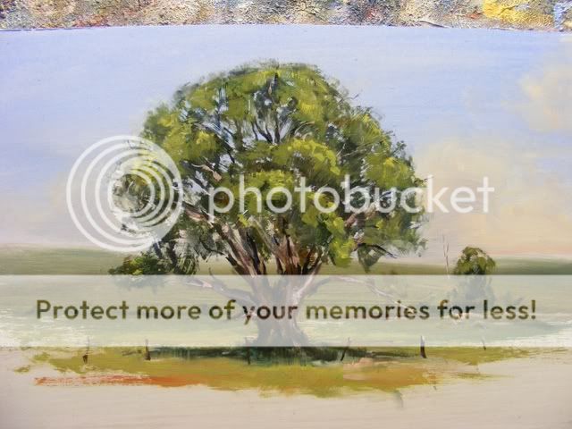
I started with a basic sky, just like the one in the first demo, and painted a hill in front of it, making the green with a blue and yellow, plus some red to control the strength of the green.
The tree was then started with a half-inch wide flat brush. When working in oils or as in this case, acrylics, you start with the darks and work up to the lights. It's the reverse in watercolour - don't ask me why :lol: This doesn't mean you can't retouch the darks later on. In fact I did that same thing for this tree.
I made a brown by mixing red and a tube green - evocatively named 'Deep Green' - plus a little blue because the brown was a bit rich.

More blue plus some white was added to that mix to vary it a bit to create depth.

The foliage was started with a one inch wide flat brush, using the deep green + some red [not much] + some dark blue [not much] I also chucked some of the brown in there for variety. I left plenty of gaps.
Next I took my fan brush - a couple are shown in the brushes photo - and added the mid tone which was a pleasant faintly yellowish green made from the deep green plus yellow and white.

The next photo shows that more dark was added after the mid tone. Sky blue was also lightly and very gently brushed over the outermost edges of the foliage mass to help it settle down into the scene.

The added darks and sky colour also mixed slightly with the mid-green, taming it down slightly, which was fine by me. If it had been too much then it would simply be a matter of adding more of the mid.
To look convincing, sky hole should usually be surrounded by darker foliage which of course is in silhouette against the sky. Similarly, branches and twigs tend to be darker against the sky. These are guidelines of course, not hard and fast rules, but it's handy to keep them in mind.
Next job was to add some gentle highlights - just a paler yellow to yellow green. It's important these aren't overdone. To get form we need three tones: dark, mid, and light, but too much light will weaken the effect.
More darks were added to the inner parts of the trunk, and some dark branches were added to the sky holes. I mixed a dark purple to the deep green for this. Small fine brush required.
Then some lighter branches were added. The basic tree trunk mix plus a good dollop of white did the trick:

Posted
Guest user
One helpful tip - the green shadow was brushed up the trunk to help marry the two together. Just a light touch and not too much paint on the brush.
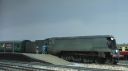
Finally a couple of views of it on my layout.

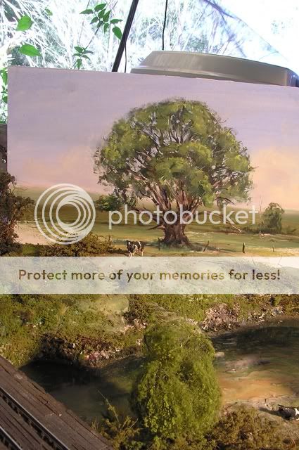
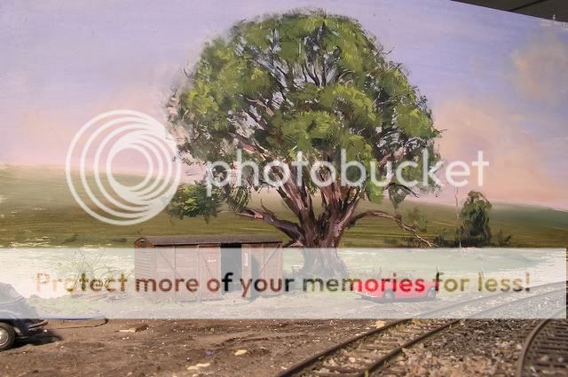
Had to be careful where I posed it because it's a fair size.
I think it would look better with buildings or modelled trees in front of it. Telegraph poles, too.
Mike
Posted

Full Member
I think this little how to is going to be of invaluable help Mike, I've always wondered how artists go their trees looking so good.
How did you fade out the distant hills? A thin wash of sky colour over the top?
Posted
Guest user
Obviously it helps to keep unnecssary details out of the distant bits too.
Mike
Edit - after thinking back, I know I added sky colour to the mix of green as I went. It's one of those things I do automatically, but neglected to mention.
Posted
Guest user
Posted
Guest user
My backboards are definitely enroute to you.
Posted
Full Member
Incredible Mike - on the first picture with the cow it is difficult to spot where scenery and backscene join!
I agree, worth mentioning that matching your backscene landscape and tree colours to your layout scatter and foliage colours is critical to get this sort of blend Mike?
Or am I just stating the bleeding obvious :oops: :lol::lol::lol::lol:
Last edit: by Marty
Posted
Guest user
Watching this backscene develop is fascinating i sure it will give members the confidence to try ourselves.
cheers Brian.W
Posted

Legacy Member
Posted
Inactive Member
Ken
'It don't mean a thing if it ain't got that Swing'
Posted
Full Member
It's always the "masters" in this hobby, be it scenery, weathering, trackwork or scratchbuilding/kit bashing, that drives the rest of us on. I wonder if you ever feel the strain of carrying us all on your backs ?
Brilliant stuff. ;-);-)
Last edit: by Petermac
'Petermac
Posted
Guest user
:eek::lol::lol::lol::cool:
Posted
Guest user
When I finally get around to painting my New England in winter backscene I'll have to remember to colour it to suit the wintry landscape - little to no green except for the pine trees, and dry golden and rust-coloured grasses. That sort of thing.
It's good to know people are enjoying this. Thankyou all for commenting. And Owen, if it helps you or anyone else on here in any way it's all been worthwhile.
Mike
Posted
Full Member
Brian(G)
Posted

Full Member
Very nice Mike
'Kev
1 guest and 0 members have just viewed this.