Painting a backscene
Posted
#22364
(In Topic #1684)
Guest user
I suggest you use as big a brush as you can handle. Here are mine [not an expensive one among them]

Pastry brushes from the supermarket are handy.
Paints are acrylics.
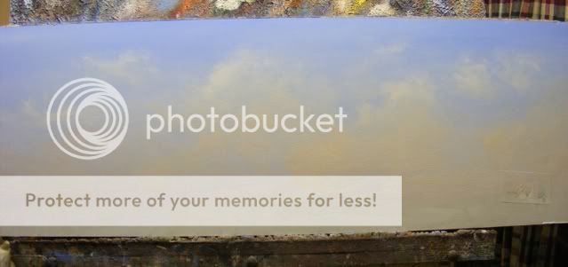
Initially the sky was an empty blue, not too dark, and grading to a paler tone down low [more white added] Blue is ultramarine with a dash of cobalt blue hue [cheap cobalt]
It's ok to leave it at that if you wish, but skies also get warmer down low, due to pollution, dust and humidity, so I like to add some soft pink into them. It's just red and white, mixed together in such a way that the pink won't darken the sky when it's added.
Here it is ready for blending:

and here it is after blending:

If you want clouds, I suggest they stay soft and vague, because after all they're just water vapour, and need to be light and airy without dominating.
For clouds I mixed up some yellow and red into a big puddle of white [acrylic primer is ideal]

Posted
Guest user

I added the cloud colour with a big [2ins wide] brush over the still-wet sky.
Some whiter parts were added, being careful to keep the "white" warm and mellow.

All edges were blended with soft brushes and the best blender of all - fingers.
Posted
Guest user

A view of it on the layout - looking like the edge of the world.
Mike
Posted
Guest user
____________________
Ron
00 scale,
Devan & Summersett Railway
Posted
Guest user
Decided to add some landscape to it, so mixed up a green from my warm yellow, ultramrine blue and white. A tiny amount of red was added to control the green.
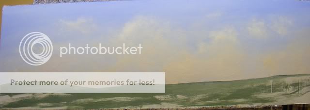
Wheat fields might look ok [or is it barley?] Mixed up a very mild yellow-orange with yellow and red plus plenty of white:
The golden colour was gently laid over the top of the green, leaving green boundaries between the paddocks.
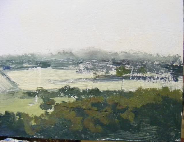
Patches and strips of trees were made with the yellow and blue + red with much less white this time - they need to be darker than the ground. I allowed them to get darker as they got closer, and added more yellow - and occasionally more red - to the mix for slightly sunnier parts to create form.
Emphasised some of the fields' boundaries with darker green for hedges.
Also made up some slightly prettier yellow-green for some pasture:
More to come
Mike
Posted
Guest user

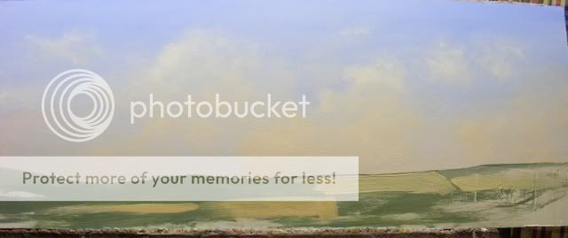
It's a bit scrappy, but it'sonly a quick job so far. Tomorrow I'll tidy it up a bit.
Posted
Guest user
One indispensable item can be seen in the first photo: a pump-action spray bottle. In this case it's an empty room freshener bottle. It mists very finely, without blobbing which would dissolve damp paint, and aids blending enormously. I couldn't get by without it. If you're considering painting with acrylics get something similar. Fine misters for ferns and orchids are ideal.
This may sound crazy but I also recommend you wear old clothing on which you can quickly wipe your hands with a minimum of delay. You HAVE to work fast with acrylics because they dry quickly, and anything that slows you down is a nuisance. I always use the shirt I'm wearing as a cleaning rag when I'm painting. It's more helpful than you might think.
Mike
Posted
Guest user

Lots more to follow.
I'll do some large trees and buildings on another board sometime soon, as well as tidying up this one, and getting some better photos, hopefully tomorrow.
Mike
Posted
Guest user
Mike, under your signature photo, you may need to add a ] after 3fedd7.
Can you supply a photo of your shirt? It must look like a Pro Hart by now!
____________________
Ron
00 scale,
Devan & Summersett Railway
Posted
Guest user
____________________
Ron
00 scale,
Devan & Summersett Railway
Posted
Guest user
I finally fixed that Photobucket link - it was pretty easy, but of course I struggled with it :)
Mike
Posted
Full Member
Sounds like a lot more fun than photoshopping photos and glueing them on.
Where's my painting shirt?
Do I have to put it on backwards like you do when finger painting. :lol::lol::lol:
 Last edit: by Marty

Posted
Guest user
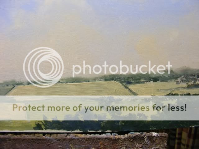
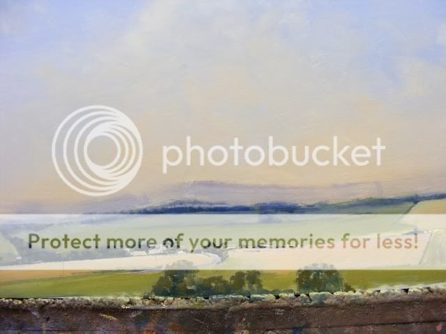
Tidied it up a bit today.
Washed some blue over the distant hills and trees, defined the paddocks a bit more and freshened up the yellow-greens in them, and added a wash of mauvey blue down low in the sky because I felt the clouds were a bit too yellow.

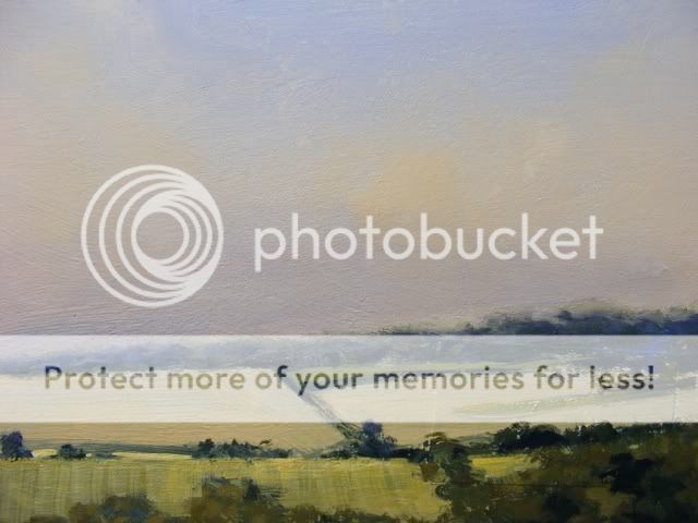
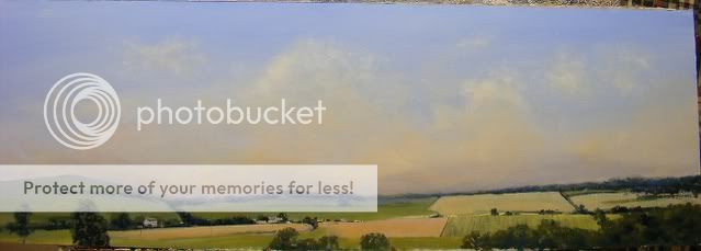
One thing I've had to do is avoid adding too much detail because I don't want to draw attention to the backscene. It's under scrutiny here but that'll be the exception rather than the rule. It's not intended to be a major work of art, just a fill-in.

Mike
Posted
Guest user
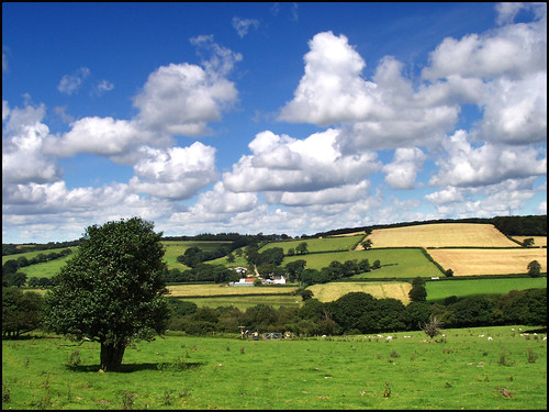
Devon countryside
Can't find the other - it was mainly used for the sky. I searched through hundreds of pages to get just a few.
Mike
Posted
Guest user
Posted
Guest user
cheers Brian.W
Posted
Inactive Member
The only thing is that anyone who is good at something makes it look easy which can be a bit demoralising for the unfortunate beginner! I'm thinking in particular of the people who watch Art teaching programmes on TV then rush out to buy the equipment - including the hat of course:roll: - and then find it doesn't work for them: "I've bought the paints so now I'm an artist" seems to be the thinking!:sad: Oh well…….
Ken
'It don't mean a thing if it ain't got that Swing'
Posted
Guest user
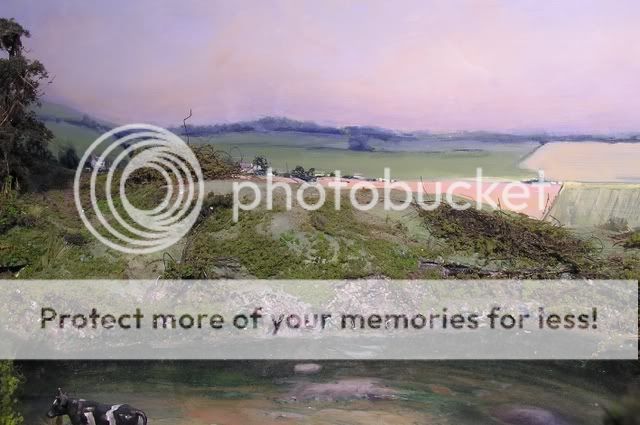
I think a distant scene like this one is probably the easiest to do. You can approximate things and get away with it.
I wanted something similar for my Swanhurst layout but found it all looked a bit empty and deserted just behind my village [what there is of it] I couldn't justify a goods yard with so few inhabitants so had to paint some houses and shops in. That and some bigger trees will be next. Should be fun.
Mike
Posted
Guest user
One last shot showing a road and houses, plus the mauve wash in the sky before blending. Meant to mention I sprayed the sky with water before applying that wash. It makes the paint land much more softly, if you know what I mean.
Mike
Posted
Guest user
1 guest and 0 members have just viewed this.