A Painted Urban Backscene
Posted

Inactive Member

Max
Port Elderley
Port Elderley

Posted
Guest user
Rick I try to get as many things in my favour as I can, starting with good reference photos. Also a well-primed board and good but inexpensive 'sharp' brushes.
Posted
Guest user
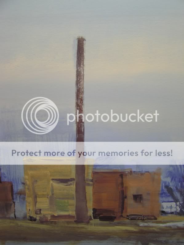
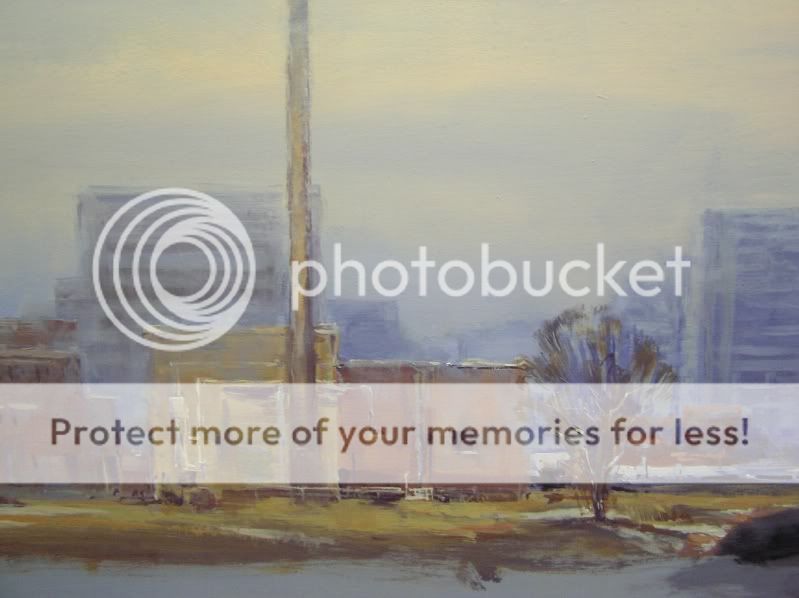
Just some blocks of brick colour. For the yellower brick some chestnut and yellow were mixed into red oxide, with some milky blue to tame it down a bit.
Paint is deliberately patchy.
I prayed for a steady hand then put in the smoke stack. It bent a bit. Had to straighten it out later….

Posted
Guest user
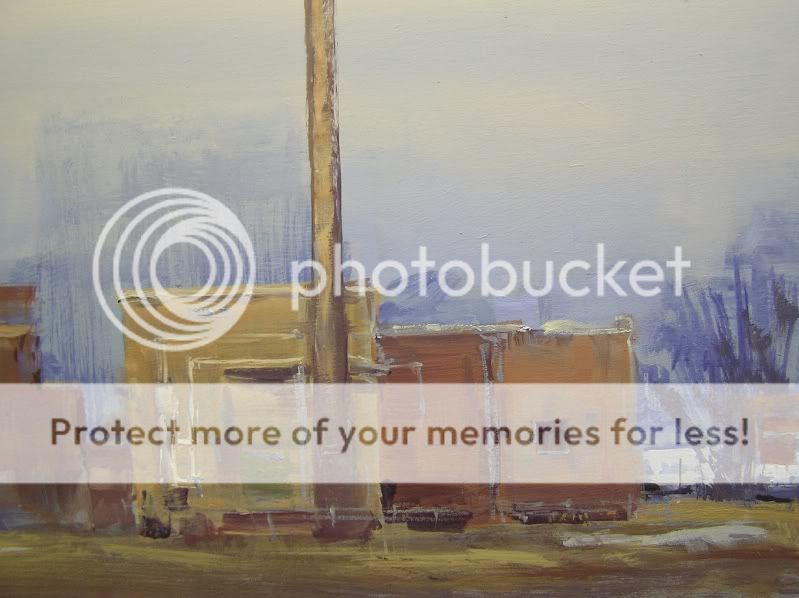
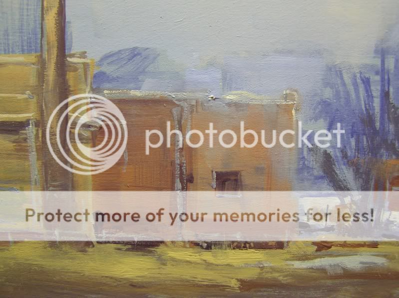
Pipes and things added with the fine rigger brush. Window on the right was just a dark square, done with a sharp brush. Framing painted around it with the rigger. A few dark accents here and there, referring to a photo as I went.
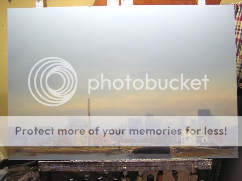
To push the building back I brushed sky colour over it
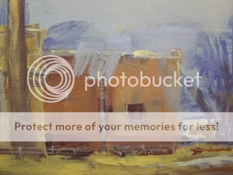
and instantly gave it a rub with a finger
The various brick colours were carefully brushed over the smokestack and smoothed with a finger. I had to build the chimney out to the left to straighten it. Sky colour was brushed across it and over its edges once the brickwork was dry.

Posted
Guest user
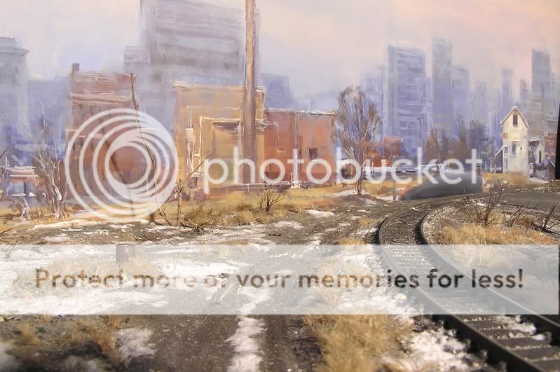
The tree was then put in with brownish paint mixed up with any old brick colour plus the darker Harbour Blue + a little black I think. Branches added with the rigger brush and some dark under it.
Posted
Guest user
Posted
Guest user
Posted
Guest user
If anyone has any questions about any part I'll do my best to answer them. And all suggestions are welcome!
Mike
P.S. the top of the chimney was tidied up with more blue and pink around its edges and some sky colour brushed over it as before in the buildings.
Posted
Guest user
If I had not seen it develop I would not know where the layout finished and the backscene began. :thud
Posted
Full Member
Two words for you mate. Bloody Marvellous!!!
cheers,John.B.:doublethumb
cheers,John.B.:doublethumb
Posted
Guest user
Posted
Guest user
Posted
Inactive Member
Max
Port Elderley
Port Elderley
Posted
Guest user
:doublethumb:wow:lol::lol::lol::cool:
Posted
Guest user
Max you're right. It has been a lot of work over too many years and I still have much to learn.
If I didn't have the best wife in the world I'd be sitting behind a desk in an office.
Hmm I think that previous sentence summed it up pretty well.
Mike
Posted
Guest user
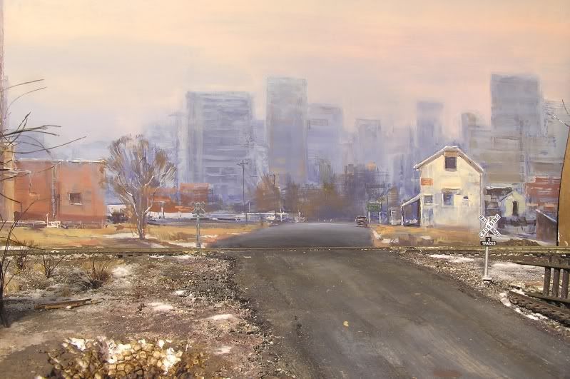
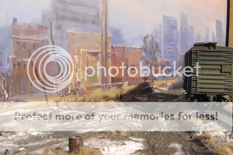
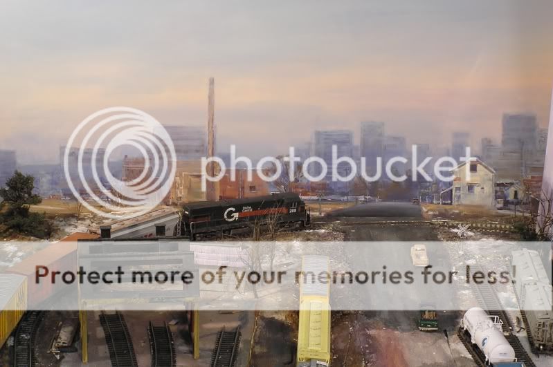
Everything good that can be said about your painting and modelling has already been written, many times, and I suspect not just on here, and I agree with all of it, but can I just point out one thing that stands out for me, and that's the shadow from the tree/twig it goes about 3/4 up the building on the backdrop, this makes the backdrop look to close, can you move the tree forward, or move the light that makes the shadow, sorry it just caught my eye.
Posted
Guest user
It must be said that it is now a distraction and serves no purpose in the general scene, therefore I would remove it totally.
Now to a question for the talented one … the background blends in very well with the model, although I remain slightly troubled by the slight "hump" in the road as it goes onto the back. My question is how would you treat the various buildings to give a variation in depth. At the moment the scene consists of coloured buildings in the "foreground" of the backscene and all the rest is a blueish colour, giving excellent depth. I'm not criticising this effect, indeed the opposite would be the case if I dared to comment, but is there a technique which gradually recedes things into the distance?? Also would this make the scene feel deeper?
Posted
Guest user
Jeff your point about the background buildings is an interesting one. It gets us into an art vs reality thing. Looking at the scene again this morning I agree totally with what you say - they go from colourful-ish to blue very suddenly. [although there's a brick building or two back there that received less blue than the one with the chimney - might have to look into that.]
Perhaps the blueness is evidence of a pretty long road past the rise in the road and a fair bit of territory between the close buildings and the city beyond.
I toyed with the idea of having a slightly more prominent building at the road's end which would have given an opportunity for it all to recede more gently but I prefer the accidental brown trees.
Certainly if I had added more warm colours to some of the city buildings at the end of the road they would have appeared closer than bluer ones beyond. A more careful and gradual control of the blue would definitely create a gentler regression from near to far.
From an art viewpoint I decided to mass them all together pretty much because I didn't want to draw attention to them as individuals. I find the overall shape interesting as a unit and suggestive of a city without defining it too clearly. Those to the immediate right of the pale building have a slightly more gradual change in them, but I was drawn to the idea of a distant city at the end of a road and hoped it would convey some sort of mood and atmosphere. Smog, snow in the air etc - all great stuff to play with.
If the scene had been one of rolling hills, for example, I would be taking fewer liberties with it, as with this one:

It's an interesting point you make and something that I [for one :lol: ] enjoy discussing.
I must take some photos of it in place but without the floodlights. It might look quite gloomy. I don't know.
Mike
Posted
Guest user
Posted
Guest user
1 guest and 0 members have just viewed this.